

Wait, I Can Break the Grid?
How deconstructing grid systems can uncover more creativity, variability, and dynamism.


Welcome to Designer, a place for designers, creatives, and the design-curious to explore graphic design styles, the history and future of design, and how art and design carry into the rest of life. In this article, we’re joining a history of rebellion against the status quo. How, you may ask? By breaking the grid.
As a prerequisite, I recommend reading my grid systems article, as it’s important to first understand how to use a grid. See the link below:

Something to consider as you read this article:
By strategically deconstructing what we’ve known for so long, what new levels of creativity might we unlock?
For many decades, grid systems have been the gold standard for “good” design. However, in the late 1970s, a group of designers raised the question, “What if all of those rules are wrong?”
Grids are tricky - on one hand, they’re a great tool used to create pleasing layouts, and are fairly accessible to designers of all experiences. On the other hand, they can be quite restrictive, turning creative potential into a design that looks like a template.
For this reason, those 1970s designers wondered what might happen if the grid dissolved.
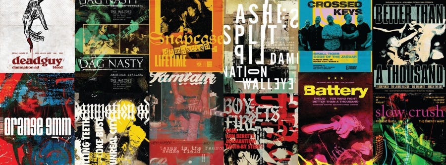
Here’s the reality - grid systems have not gone away, and they likely never will. With the rise of user interfaces on social media apps and websites, the grid is more powerful than ever, often used to organize information so that most people can confidently navigate pages they’ve never visited.
But herein lies the issue… The main reason I’m researching grid systems and how to break them…
Grids have become so commonplace that, if a design isn’t thoughtfully composed, the general population glosses over it without a second thought. Essentially, digital media has caused grid systems to become so saturated that the novelty has worn off.
With this thought in mind, I’m proposing that modern-day designers should aim to strike a balance between using and breaking the grid. Let’s add a little bit of novelty back into design!
Before we learn how to break the grid, though, we must go back in time to learn about its origins…
A Shortened History of Grid Deconstruction
As with all design movements, the pendulum swings back and forth… Breaking the grid, however, is still a fairly new development, meaning the pendulum has only swung a couple of times. Let’s go back a couple of centuries to gain some context.
During the Industrial Revolution, as the printing press gained popularity, grids were a necessity. To streamline the printing process, printing companies utilized a column grid to align text. At this time, it was rare and costly to see any deviations from this grid system.
As technology advanced and the written word could be reproduced more easily, grid systems transformed from a necessity to societal preference, particularly with the rise of modernist design movements (between 1880 and 1940).
For more information on the Swiss Design Style (aka, International Typographic Style), see my article below:

It was around this time that the pendulum had swung to its climax, with many designers believing that grid systems were the pinnacle of “good” design.
By the 1970s, a group of designers began to question the international typographic style. Rather than adhering to the status quo, they proposed that designers should aim to push the boundaries farther than ever before - they should break the grid.
And as we see time and again, the pendulum began its descent…
Over the next couple of decades, more creatives experimented with grid deconstruction, leading to the rise of the Punk/New Wave and Grunge movements. A couple of the fundamental designers pushing these movements forward were:
Jamie Reid (1970s Punk Movement) >
Experimented with the physical art of cutting, pasting, and collaging to express himself visually.David Carson (1990s Grunge Movement) >
Created highly experimental designs, focusing on feelings and emotions rather than clarity and organization. His designs were controversial and caused heated debate at the time.


These designers believed that, contrary to popular belief at the time, design could be messy, personal, and avant-garde, and still communicate a message to the viewers. “Functionality” wasn’t the sole driver of success.
From this point on, there have been loud voices on both ends of the spectrum - those who stand by minimalist, functional designs, and those who oppose the status quo. With increased access to the internet and, in turn, the world, we see many creatives pushing both movements forward.
In 2026, I feel like we’re in the direct middle of a pendulum swing. There’s quite a bit of discourse amongst Gen-Z who long for Art Nouveau, ornamentation, and messiness in design, which is particularly different from the “millennial gray” aesthetic many of us grew up with.
Understanding this raises an important consideration for all designers: design fields are constantly evolving due to pressure from cultural shifts, technological advancements, and user preferences. Due to this, we must continue to learn, adapt, and lead the change.
Alright… Now that we understand the history of grid deconstruction, how do we actually do it, and well?
Ways to Break the Grid
In my research, I’ve found that there are many ways to break the grid. For ease of understanding, I’ve categorized each of the main methods into two buckets: First, simple, and then, complex ways.
Simple ways to break the grid


Break the margin >
One of the easiest ways to break the grid is to break the margin. Pushing certain elements outside the margin, while keeping others contained, adds a bit of intrigue to the design.
Example: Add an unexpected shape outside of the grid.Layering >
Layering is one of my favorite techniques for breaking the grid. One of the loudest critiques of grid systems is that designs can come out looking flat. By layering certain elements, you begin to trick the eye into thinking that the design has depth - that it’s 3D-like.
Example: Layer an image over a shape to create the illusion of depth.Adjusting gutters >
Gutters are the negative spaces in between elements on a page (think of Pinterest, where each rounded square has white space around it). Adjusting the gutters - whether making some high, low, thick, thin, etc. - breaks the grid and can help guide the eye from element to element.
Example: Use large gutters on one side of the design, then small gutters on the other. This creates an illusion of items flowing together.Breaking established patterns >
Each segment of design has certain patterns - whether you’re designing for a magazine, corporate entity, or newsletter, the designers before you have set “standards” in place to influence how designs in the same category should look. Breaking these established patterns is one of the greatest ways to shock an audience and make them feel something.
Think of this example: You’re scrolling on TikTok, and the bulk of the content you scroll past is loud, bright, and fast-paced. Then, you scroll onto a video of a quiet man hand-drawing a logo design, and all you can hear are the real sounds of pencil and paper. This breaks the pattern and will likely grab your attention.Unconventional layouts >
Relating to the example above, rethinking the “standard” for how a design should look is another way to break the grid. Think: could a circular or diagonal layout offer a much-needed break from the common grid-based compositions we often see? Consider how you might unexpectedly place each of the elements.
Examples: What if you use a baseline grid on a magazine, rather than a column or modular grid? Or, consider how A24 movies might stray away from the rule of thirds to capture a unique shot, therefore garnering different emotions.
Complex ways to break the grid
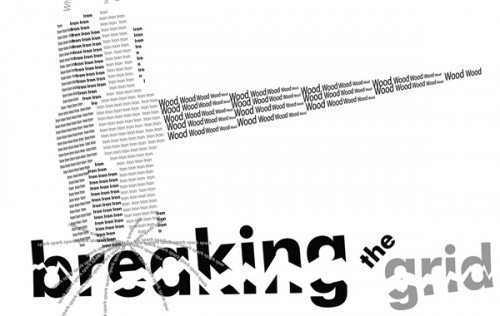
Linguistic deconstruction >
Deconstructing type, fonts, font color, font size, font placement, etc.
In the English language, many designs follow the natural rhythm of how we speak. For example, prominent sections of dialect are assigned a heading, filler words are assigned smaller “paragraph” text, and examples are usually shown in italics. However, what happens when we break this down and do something unexpected?
When using linguistic deconstruction, designers break the expected rhythm of language and create new patterns. A great example I’ve seen recently is a design that assigns each verb a bold and large font, drawing the eye to action-related language. In doing so, the designer hopes to call out the actions they want the viewers to take.Spontaneous optical composition >
This tactic invites designers to use spontaneous, quick judgments to associate certain elements together. Similar to how one might collage, designers first focus on the associations between elements to influence their placement, then they clean it up and make it look and feel intentional. If done correctly, it can offer an inviting experience for viewers, given the immediate recognition of related elements.Conceptual/pictorial allusion >
Rather than using a grid to place elements in a composition, this strategy allows designers to place elements in a way that graphically represents a concept. If you’re creating a flyer for an American rodeo, can you organize the information in a way that, from afar, it looks like an American flag? If you’re designing a timeline, can you organize it such that information from the beginning is small, and current information is large? Doing so creates the illusion of time passing.
Designing this way can create an emotional or visceral response in viewers.Chance operation >
What happens when we introduce chance into the design process? Similar to how a painter might fling paint onto a canvas, then work with what chance gave them, a designer might blindly place certain elements in a composition, then build from there.
One of the biggest problems I run into is “expert” blindness, or getting so deep in the weeds of a design that I miss something that should have been obvious. The unpredictable results of chance operation can decrease expert blindness by surfacing errors that might have gone unnoticed. Breaking the grid in this way can be illuminating, allowing a designer to see the work in an entirely new light.
As always, these are just suggestions - there’s no “right” way to break the grid. Grid deconstruction was born out of a distaste for “rules”, so go ahead and break any rule you see fit!
Tips for Beginners
While there are no official rules on how to break the grid, here’s an easy strategy for any designer who’s new to this process.
First, try creating your design with a grid (I know this sounds counterintuitive, but stick with me).
Then, once everything has been placed, take certain elements and break them out of the grid strategically.
The goal is to break the grid AND make it look intentional. By designing with a grid first, then breaking some elements out second, the design looks intentional, intriguing, and dynamic.
When to consider not breaking the grid
The decision to use or not use a grid comes down to the nature of the project. I’ve said it once, and I’ll continue saying it for the rest of my design career: You MUST understand the audience and context when designing. Otherwise, you may completely miss the mark.
That being said, there are specific scenarios in which you might consider using the grid, rather than breaking it, including:
Anything that needs to be highly readable
A subway map/wayfinding system
A graphics standards manual
A technical manual
Working with strict brand standards.
Corporate flyers
Data-heavy communication
A novel or academic text
Conclusion
I read a great quote the other day that went like this: Do anything you can to break up the norm, and doing so will garner attention from your viewers.
When I read this, I instantly thought of social media - with the rise of doom-scrolling and brain-rot content, people are so used to seeing fast-paced, bright, hyper-saturated videos that grab their brains’ attention with each consecutive swipe. However, with this comes a decrease in novelty - soon, every video looks the same.
As designers, we need to be asking ourselves how we can break out of the norm to push our work forward. Breaking the grid is one of those ways.
The bottom line is that design is all about storytelling. Ask yourself: “What story am I trying to tell? One of clean organization? Or one of avant-garde creative pursuits?” After you have a solid answer, you’re one step closer to making or breaking the grid.
As always, thank you for reading and/or listening to this article! I’d love to continue the conversation with you in the comments and subscriber chat.
Related resources I found helpful
Making & Breaking the Grid, Timothy Samara
Grid Systems in Graphic Design, Josef Müller-Brockmann
https://arenaparkstreet.com/breaking-the-grid-innovative-layouts-in-graphic-design/
https://www.secretstache.com/blog/how-to-effectively-break-out-of-the-grid/
https://usabilitygeek.com/when-how-break-grid-layout/
https://design.tutsplus.com/tutorials/how-to-design-with-grids-and-break-them--cms-34124
Not too long ago, certain web browsers broke the grid whether we wanted to or not. Responsive design is always filled with trade-offs, so most frustrating. 2-D print stuff is where the sandbox is and it's where I prefer to play. Thanks for sharing -