

Are You Using Grids Wrong?
How to Build and Use Grid Systems Effectively.


Welcome to Designer, a place for designers, creatives, and the design-curious to explore graphic design styles, the history and future of design, and how art and design carry into the rest of life. In this article, we’re delving deep into grid systems, exploring their impact on relationships, hierarchy, and the viewers’ experience. From inspecting the earliest accounts of grids to modern-day applications, you’ll learn how to use the grid effectively.
I think I’ve found the fix to my layout problems
I’ve created numerous designs where all the elements are there, but something just felt… off… It’s not that the elements within my design were bad; it’s that my layout had no structure. After researching grid systems, I believe that this is the fix to my layout problems… The thing I’ve been searching for… The grid!
*Cue The Grid from the Tron soundtrack… (I don’t think I can add it into my voiceover for copyright reasons)
As a quick precursor, let's define a grid and a grid system.
A grid is made up of overlapping vertical and horizontal lines, creating a visual organizer that allows designers to easily plan the layout of images, text, colors, and other design elements. Primarily, it’s used for alignment, hierarchy, consistency, and ease of design.
A grid system pushes this further by formalizing the grid details into a reusable asset, helping designers and creatives organize information more easily.
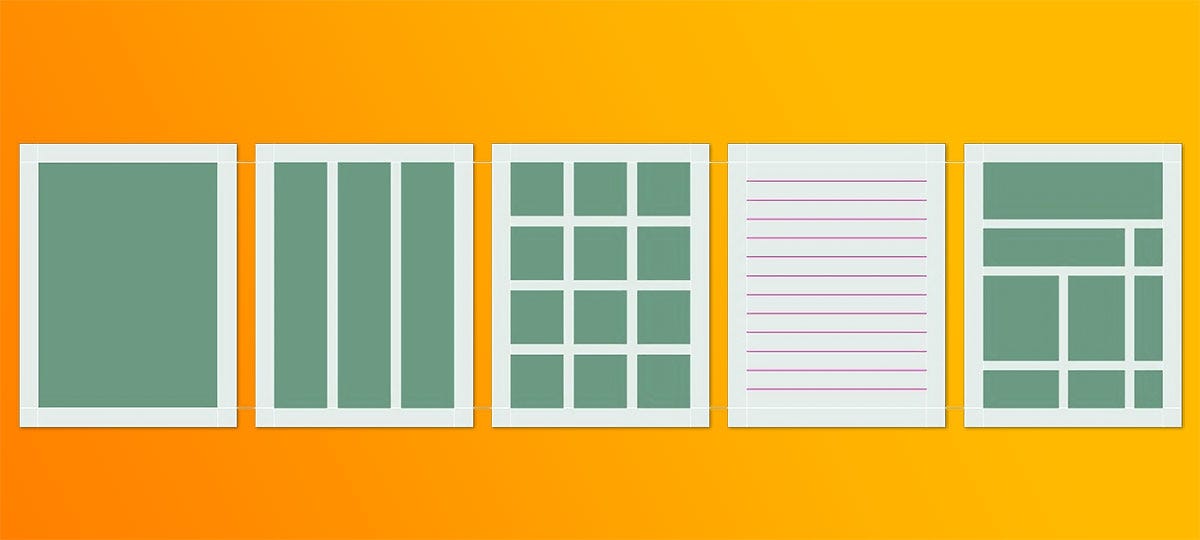
But why should we care? Plenty of successful designers don’t use grids… right?
Well, some designers may design without grids, but I’ve found that the professional standard includes some sort of grid-based system in their design processes. In my work, I’ve seen several enhancements, including:
Grids create visual ease. We know two things to be true: 1) By nature, humans seek out organization, and 2) The job of design is to communicate something to viewers. So, organizing the information in a grid creates a communication system between the design and the viewer.
Using a grid system makes design work faster and more consistent across projects containing multiple designs. Remember, in the design world, consistency is key!
Grid systems enhance the user interface (UI) and experience (UX). They help associate items, make certain elements more prominent, and create visually appealing designs.
I used to think a grid system was like a coloring book - fun, but a bit creatively restrictive, requiring that you stay within the lines. However, a grid doesn’t necessarily need to be a constraint - I’ve found that it can push designs further than previously thought.
With that in mind, let’s go back in time to learn about the history of grids.
A (Massively) Shortened History of Grid Systems
Each time I research a new design-related topic, I like to go back in time and learn about its origins. This gives me much more context into why it was created, how it was used, and how it has changed over the years. Grid systems have an interesting history that started a really, really long time ago. Let’s get into it.
-
Early accounts of grid systems date back to the Romans and Greeks, who used them to document texts, plan cities, and divide land. From this time onward, grids continued to be casually utilized in strategic planning and documentation.
The grid’s “big bang”, however, happened during the Industrial Revolution (roughly the 1760s). This era saw rapid technological advancements, which required not only more information but also a way to organize this information. Business owners realized that to increase efficiency, employees needed standardization, documentation, and communication.
During the Industrial Revolution, more businesses were established, people moved from rural areas to urban centers, and opportunities for wealth became increasingly accessible. As this rapid growth continued, business owners were met with another problem - they needed people to know about their business.
To remedy these business-related issues, grid systems became commonplace in design/marketing fields, beginning the era of strategically organizing designs to influence prospective customers.
Around the same time, there was a need for higher-quality education, especially as more people moved into cities. To teach the new generations about business, accounting, and other business-related topics, textbooks, newspapers, etc., needed to be organized and understandable.
By the mid-nineteenth century, the need for organization was so great that grid systems were created to easily replicate structure from one text to another. One of note was the multi-column grid, which was primarily used for detailed newspapers.
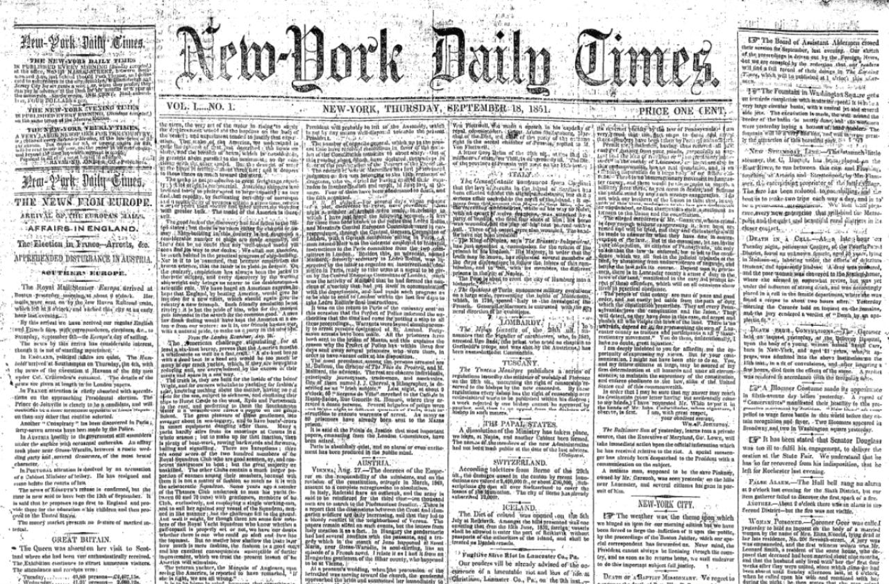
The Arts & Crafts movement (1880-1910) built upon the grid’s increasing popularity and sought to use it as a tool for social improvement. Several writers and artists believed the grid (a tool for clean, simple organization) could be a greater reflection of a “more perfect society”. They idealized the functionality associated with grids and felt that the organization of art, design, products, and architecture could contribute to the beauty of the growing world.
Although previously utilized in the design field, grids became even more common in the early twentieth century. Following the De Stijl and Bauhaus movements (see my article on the Bauhaus here), several designers published revolutionary works that influenced how grid systems were used in design.
Jan Tschichold (The New Typography) and Josef Müller-Brockmann (Grid Systems in Graphic Design) each created highly influential works on grid systems.
This brings us to the modern-day grid systems that have continued to evolve with the introduction of the internet, cell phones, and screens.
Grids in the Digital Age
Nowadays, grids are seen across all sorts of digital media. Specifically in design fields, grids are used to plan digital posters and flyers, create interfaces that provide a satisfying user experience, assist in web development to keep viewers scrolling, and much, much more.
The “attention economy” is one of the biggest profit drivers we see today. Whether it’s scrolling on Instagram, TikTok, Twitter, YouTube, Substack (this one, preferably), or other social media platforms, your attention is what drives ad revenue and a multi-billion-dollar creator industry.
These platforms have mastered the use of grid systems to make the app interface visually appealing and easy to use. Doing so keeps you scrolling by making each swipe more satisfying than the last. It’s quite a concerning (but ingenious) use of grids.
Personally, using grid systems in my design work has had numerous benefits. For some background, I primarily design eLearning courses, flyers, websites, infographics, and illustrations. Since starting to utilize grids, my designs have become more consistent and easier to plan.
-
Ultimately, grids were created to solve an organizational and communication problem. As they’ve evolved over the years with technological advancements, the goal has stayed the same - to organize information so that it’s easily digestible by the audience.
Now that you understand a bit about the history of grids, let’s learn about the many types of grids used by designers.
Types of Grids
Well, it turns out there are many different grid systems out there; too many for this one article to detail. Rest assured, though, I plan on doing in-depth articles on each grid system in the future, so keep an eye out for those. For now, let’s discuss each of the major grid systems and how they’re commonly used.
A quick note about grids: Although all grids are made up of horizontal and vertical lines, the specific makeup of those lines fundamentally changes the look of a design. Because of this, different types of media have “claimed” certain grid styles, which is why you’ll often see magazines, newspapers, and websites all having very similar structures.
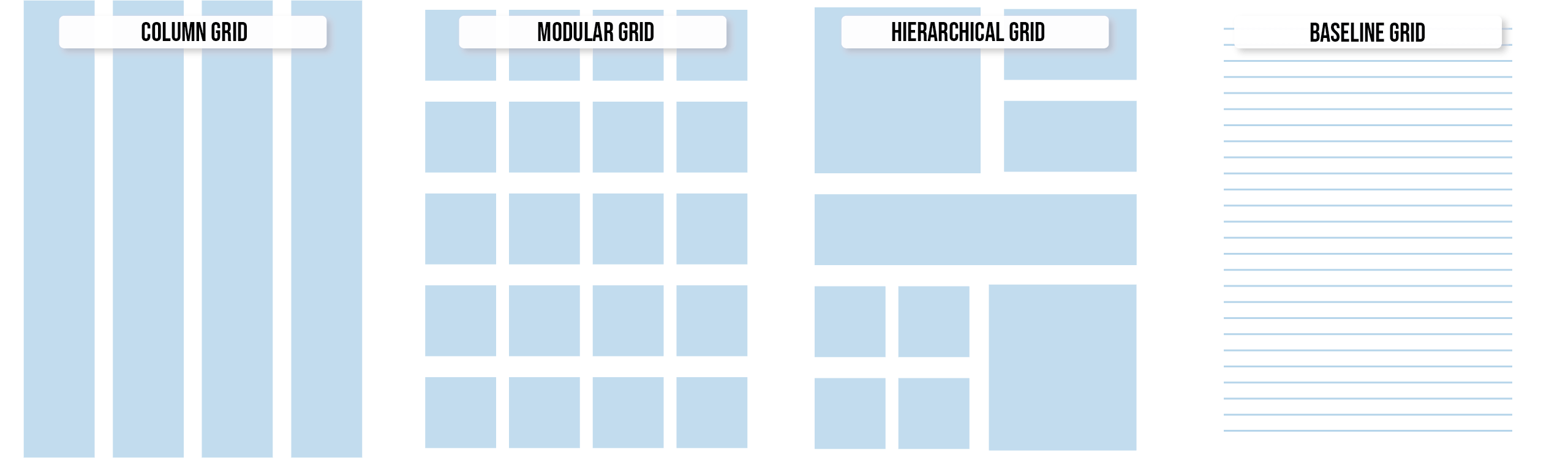
I’ve found that designers will most commonly use four types of grids, shown in the illustration below. Take a look as I break each of these down.
Column grid >
Column grids are made up of a pre-determined number of columns (most commonly 1, 2, 4, 6, or 12). This grid is used to divide a screen, book, or paper into multiple tracks, allowing for easy tracking between columns of text and associated images.
Column grids are most commonly used in magazines, newspapers, and multi-column websites to organize content while still maintaining balance and structure.
Modular grid >
Modular grids are composed of vertical and horizontal lines, dividing the page into an equal number of squares, or “modules”. When using a modular grid, a designer benefits from a structural framework that offers easy planning of text, graphics, images, and color blocks.
Modular grids are often used on projects that have multiple different types of content/elements, such as websites, apps, and any other UI design. The main focus of a modular grid is to present elements with symmetry in mind.
Hierarchical grid >
Hierarchical grids are made up of different-sized modules that allow a designer to strategically plan a design’s layout. When using this grid, designers will place elements by order of importance, reserving the larger modules for important information and less prominent modules for supporting elements.
Hierarchical grids are great for landing pages, portfolios, and text-heavy layouts.
Baseline grid >
Baseline grids are made up of evenly spaced horizontal lines that dictate where your text, images, and other design elements will sit. These grids ensure that body text, headlines, captions, and images are aligned, ensuring clean and consistent spacing. Further, baseline grids increase readability by associating certain elements together and creating a subtle hierarchy.
Because these grids improve readability and aesthetics, they’re best reserved for documents and text-heavy pieces.
Other, more niche grid systems include:
Compound grid >
Compound grids merge multiple types of grids to strategically utilize certain elements of each. Doing so allows for layout flexibility while maintaining a clean appearance.Manuscript grid >
A manuscript grid is a single-column grid that’s used to organize the text in a book or manuscript. Utilizing one column and margins on each side, this grid creates a natural flow of text from one page to the next.Circular grid >
Circular grids are most commonly used in logo creation, allowing for symmetry and balance.Square grid >
Square grids are most commonly used in galleries, providing a clean, uniform tone. Elements are aligned in neat squares, making content easy to navigate.
The one piece of advice I have when using a grid is to intentionally include breathing room. Negative space is your friend, and it will help maintain hierarchy and visual interest. The last thing we want is for our designs to look cluttered.
Designing With a Grid
Designing with a grid seems easy - simply place the images, text, colors, etc., in the respective modules, then go on with your day. However, expert designers are intentional with every decision they make; they don’t just plug and place.
As I have researched and done some practice projects with grids, I’ve noted the step-by-step workflow that has sharpened my processes.
-
First, inventory your design elements.
Have a general idea of the design elements (text, images, logos, etc.) contained within the project. In this stage, put your design into context and allow these elements to decide the grid. For example, an image-heavy book cover is likely going to use a different grid than a text-heavy corporate flyer.
Use margins as a design tool.
Choose margins intentionally. A generous margin can give off a calm, premium, or editorial look, while a tighter margin can feel bold and energetic. This piece should feel like a choice, not an afterthought.
Then, begin your design with structure, not decoration.
Decide which of your elements are the most important - ask yourself, “What should people see first?” Organizing the information this way helps the process feel more considerate, more intentional.
Once you’ve decided on the structure, place your text.
Text is one of the elements that communicates information to the viewer, so the placement is quite important. For comfortable reading, aim for 7-10 words per line in your text strings. Then, build the rest of the design around those text blocks.
Once the text is comfortably placed, use the grid to create hierarchy.
Place the important elements in more prominent spaces. Decide what else should be big, small, loud, quiet, associated together, etc.
After you’ve placed all of the elements, ensure that all elements are aligned and follow the same system.
Make sure that all text, images, color blocks, etc., are the same pixel width, follow a consistent grid pattern, and look cohesive. Small misalignments can make the design look messy.
Finally, once you’re finished designing and are happy with the end product, ensure a similar grid system is used across the entire brand/set of associated projects.
Consistent use of grids links designs together, creating a visual connection between projects.
Conclusion
Grid systems are used to create order, assign hierarchy, and naturally guide the viewers’ eyes around a design. While the history of grids goes far back, they’re continually an essential element of design, especially as technology continues to advance at a rapid rate.
Although I haven’t researched and utilized grids this in-depth before, I’ve found that they’re a highly beneficial tool, especially when designing multimedia projects. Some questions I still have on my mind are:
What will happen with UI-based grids as screen sizes continue to differentiate?
Are there grids that haven’t been thought of yet?
As always, thank you for reading and/or listening to this article! I’d love to continue the conversation with you in the comments and subscriber chat.
Related Media I’ve Found Useful…
Grid systems in graphic design, Josef Müller-Brockmann
Making and Breaking the Grid, Timothy Samara
https://baselinehq.com/4-grid-systems.html
https://www.masterclass.com/articles/grids-in-design