

Why Do Some Things Feel Expensive?
“Expensive” is rarely about cost; it’s about restraint, pacing, and intentional design choices.

Welcome to Designer, a place for designers, creatives, and the design-curious to explore graphic design styles, the history and future of design, and how art and design carry into the rest of life. This week, we are exploring why some designs feel expensive. Through a thoughtful analysis, we’ll explore how color, typography, restraint, and other factors create an atmosphere of luxury.


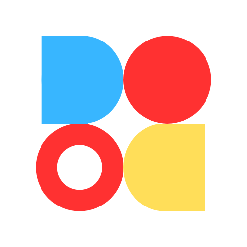
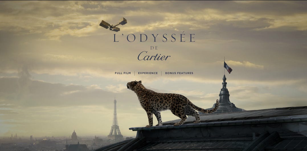
Why does the first image feel expensive, but the second image doesn’t? What design and branding choices have these companies made to influence your perception of “luxury”? Every design choice is intentionally made to influence the public perception, whether that’s to sell luxury goods or budget-friendly items.
“Luxury” or “expensive” design is such an interesting facet of the design industry. Truthfully, “luxury” is determined by whatever society deems to be expensive at the time; it is completely subjective to each person. Although it’s subjective to an extent, several themes in design today make a design feel expensive, such as color, material choice, restraint, typography, cohesion, and more.
Each of these will get its own essay in the future, but I’ll touch a bit on the most important parts of each and its role in making something feel expensive.
Feelings/Connectedness to the Design
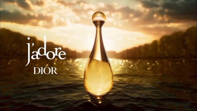
Luxury often sells a feeling rather than a product, and a design helps consumers/viewers imagine what it would be like to interact with the brand or product. Some feelings often associated with luxury are calm, confidence, exclusivity, sophistication, and aspiration.
Brands pay special attention to the storytelling element of their designs - a good design not only communicates the key message, but tells a story through visual queues and evokes feelings in the viewers. Good design combines all elements of design to create an atmosphere, or a perfectly curated bond with the brand.
This all helps the viewer slow down and take a moment to imagine their life with a product or service in it.
The following elements break this down: color, materials, layout, type, and more. Each plays into creating an atmosphere of luxury.
Color


Deep, rich colors often feel more expensive, rare, and high-quality than bright, neon, or overly saturated colors. As shown in the images above, deeper colors convey an essence of luxury unmatched by other hues.
Color is interesting to work with, especially because it has the power to evoke strong emotions. Think about this in the context of sports fans - a fan can easily distinguish their favorite team’s shade of blue from a rival team’s similar shade of blue. Even though the colors might be close in hue, one evokes strong positive emotions, while the other evokes even stronger negative emotions.
Color plays a large role in perception, which is why designers need to use it carefully. Let’s look at each of the main categories to consider:
Limited color palette >
When looking at luxurious brands, designs, etc., you might notice that they often have a limited color palette, which makes the design feel intentional and controlled. By limiting the colors they use, they allow themselves room to play with designs while still keeping guardrails around the public perception. Too many colors without a sound understanding of color theory can look chaotic or cheap, which many brands want to avoid.
Monochromatic palettes >
A monochromatic palette means selecting various hues of colors that are all in the same color family. For example, three different shades of blue make a monochromatic palette. These palettes often feel calm and refined; they’re easy to look at by allowing the eye some predictability. Additionally, the colors will never fail to combine well.
High contrast >
High contrast palettes, on the other hand, move the eye around a design easily. It shows the push and pull of various design choices, making it look luxurious. It’s important, though, to balance the colors well, else it may look chaotic.
Quick tip: If you’re using a high-contrast color palette, choose a softer font that gives the eye a break.
Matte-looking colors >
Matte-looking colors give an essence of luxury over glossy or overly vibrant colors. Think about a luxury brand - you’ll likely never see them associating with neon or overly shiny colors. Instead, they’ll choose a deep matte-looking blue, red, or black, because these colors are often associated with luxury.
One bold ”Hero” color >
A “hero color” is defined as one color that contrasts with the rest of the design palette, drawing emphasis to specific areas of a design. One bold hero color used sparingly can feel more expensive than many colors used equally; It makes the design easy to look at, softly guiding one’s eyes exactly where it should go.
Important consideration: A key theme that pulls this section together is lessening the mental and visual load on the viewer. A “luxurious” design often emulates softness and care, making the brand easy and effortless to interact with.
Color alone cannot signal luxury; it works in conjunction with material choices, layout, and typography to influence the design’s perception.
Material Choice (Digital and Physical)
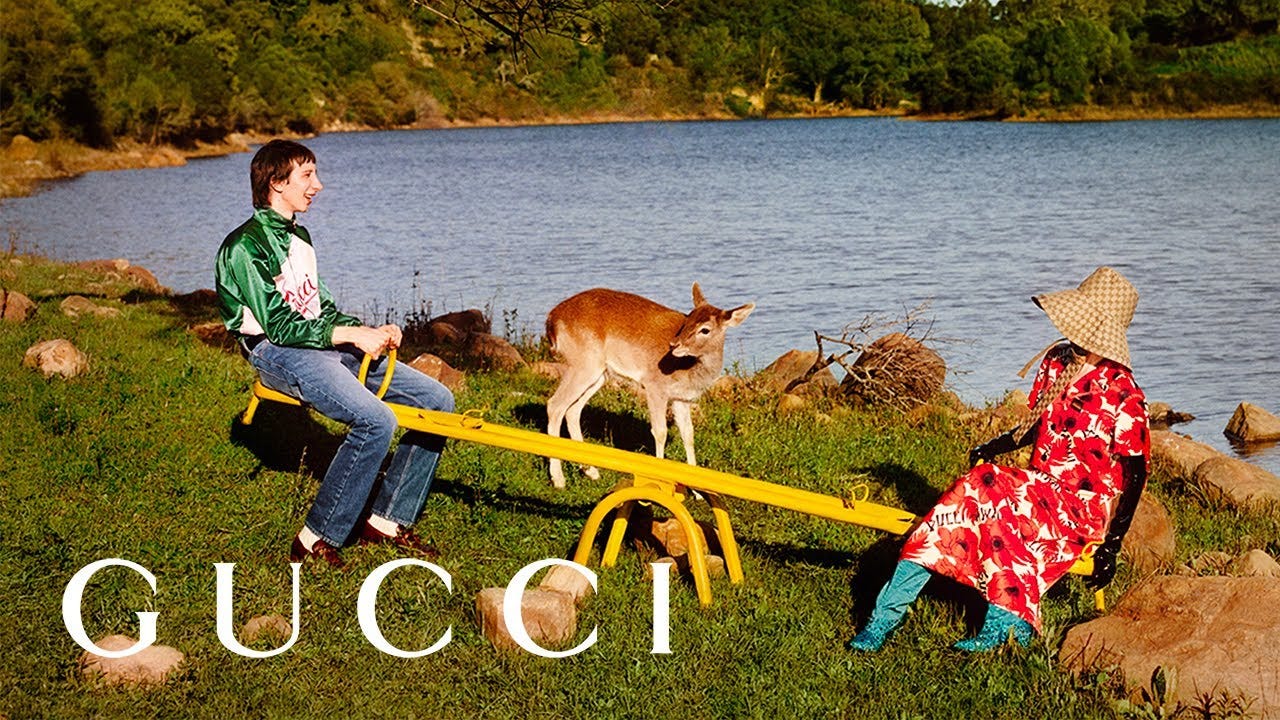
In physical designs and creations, certain materials have historically been associated with luxury, such as silk, leather, marble, and metal. Although a much newer field, digital designs also have certain material choices that are associated with luxury, such as image choices, animations, smooth typography, and textures.
In digital design, there are several considerations, outlined below:
Image choices >
Image choices (including photos, videos, type rendering, icons, and more) instantly identify a design as luxury or cheap.
High-resolution images and graphics are obvious, but something that easily sets brands apart. Even if the images look high-resolution, ensuring that they hold their resolution when zoomed in is an essential part of the picking process. Although some images or stock image sites can be expensive to purchase, you’ll never catch a luxury brand flaunting anything other than the highest-quality images.
On a similar note, many luxury designs omit stock-photo cliches, or images that you can CLEARLY tell were taken from a stock image site that hasn’t been updated since the year 2001. Good adult learning/design theory suggests that designers should make the media relevant to the viewer. A luxury brand almost always puts the viewer at the forefront of their design process, creating an atmosphere where they can picture themselves with a product or service. Using relevant images/media will amplify the message a brand is trying to send.
The last consideration is ensuring the art styles stay consistent throughout the brand or set of designs. This not only signals competence as a designer and a brand, but also serves as a “brand identifier” for viewers who have become accustomed to seeing that art style. This is why many luxury brands have a team of designers who work specifically on creating their own art.
Type >
Type, which has its own section below, also plays a large role in the overall “material” palette of a design. Not only should it communicate luxury through the strokes and spacing, but it should also have crisp rendering and perfectly combine/blend in with the rest of the design to look cohesive.
Subtle textures and lighting effects >
Finally, the textures and lighting effects in a design play a large role as well. As discussed in the “Color” section, matte colors and finishes often feel more premium than bright or shiny finishes. It brings an essence of calm and a natural ambiance into a design.
Cross-disciplinary reference: Think about the luxury fragrance commercials you see online. Many of them feature linen, ocean waves, or other natural, earth-like tones. They do this because it makes the viewers feel calm and safe, as if their life would feel like “living by the warm ocean breeze” if they purchased that product.
In addition to textures, lighting effects add depth to a digital design. Strategically placed drop shadows, or other features that make the design “pop” out of the screen, take it from a flat design to something the user feels like they’re interacting with.
Layout/Restraint
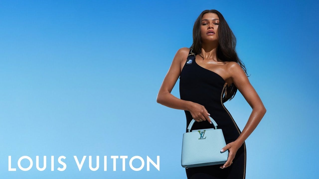
Allowing the design room to breathe is essential for making something feel expensive. What does this mean exactly? Often, you’ll see one or two statement elements that give the design a luxurious look. It doesn’t need to rely on more elements, because the space is used well enough that the message is sent with as few elements as possible. This strategic restraint signals confidence.
There are several aspects to break down regarding layout/restraint:
Attention Competition >
We live in an attention economy, where brands and media are fighting tooth and nail for viewers’ attention. As discussed in several previous categories, luxury brands want to make their designs calm and easy to look at, separating from the chaos that the general public experiences throughout their lives.
To accomplish this, many luxury brands will aim to say more with the fewest possible elements in a design. When there are fewer elements in a design, fewer things are competing for a viewer’s attention.
In luxury designs, using fewer elements more easily creates a clear hierarchy, easily pointing eyes in the right direction. It also allows for elements to be spaced generously apart, giving the entire design room to breathe.
Quick tip: Many designers will use a grid to strategically place elements on a design. Doing so allows a designer to figure out placement patterns that represent a brand, then easily recreate it time and again.
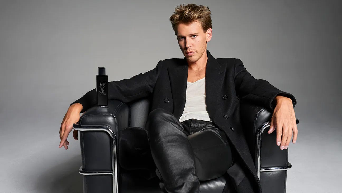
As seen in the image above, YSL only has three elements in this design - Austin Butler, a sleek chair, and the scent Austin is promoting. This is strategic, pointing the eye to exactly what the brand is selling - the fragrance, and a chance to feel as “cool” as Austin Butler.
Signals Discipline >
Minimizing the number of elements in a design signals discipline. It can seem like a good decision to include more information that gives the viewers context for a product. However, luxury brands often scale back their designs, focusing on the feeling of a product rather than information. It makes the product or brand seem more mysterious, disciplined, or expensive.
Typography


Typography instantly signals luxury, and is often recognizable even when it isn’t paired with a brand. The stroke, kerning, and spacing of the letters communicate the tone of a brand/product, even without knowing what the exact offering may be. There’s a lot of responsibility that comes with choosing a font to represent your brand, which is why brands and companies spend hundreds of hours creating their own custom type.
There are several considerations to keep in mind when representing a luxurious brand with typography:
Visual Elements >
Typefaces communicate as much about the brand as the words, and sometimes even more. The typeface chosen should match the brand personality (luxury, playful, modern, etc.).
Many luxury brands will include decorative elements without going overboard. It’s a delicate balance between communicating style and essence without feeling cheap or messy.
Serif vs. Sans-Serif >
Serif: A small decorative line, stroke, or embellishment attached to the end of the larger main strokes of a letter in certain typefaces.
Serif fonts are often associated with tradition, heritage, and prestige. In academic books, intellectual works, and research papers, you’ll largely see serif fonts accompanying the work. Serif fonts often communicate intellect or high class, using the ornamentation to beautify the words on the page. Many luxurious brands will include not only serifs, but also custom, overly emphasized serifs to communicate how luxurious their product or service is. The fonts shown above are a great example.
On the other hand, sans-serif fonts are often easier to read, and associated with works where it is extremely important to be able to read easily - think road signs, manuals, guides, or charts. While luxury/expensive brands will also use sans-serif fonts, they’re usually saved for the body text or manuals, not the main design work.
Custom Fonts >
Custom fonts are created by many luxury brands to perfectly curate the tone, and will often include high-contrast strokes (a unique dance between thick and thin strokes that looks pleasing to the eye) to elevate a design. They want their work to be seen as elegant and refined.
The brands that take on the challenge of creating their own font can perfectly align letters, kerning, and ornamentation to their liking. This is why it’s even more important to have a sound creative direction when building a brand.
Pairing of Heading and Body >
When multiple fonts are needed, a good pairing between the heading and body text will create a consistent message. Remember, all parts of a design send a message to the viewers, and pairing the heading and body font can say as much (if not more) about the brand as the words on the design/screen.
Integration of Separate Elements/Cohesion
A design should feel like one cohesive unit rather than an amalgamation of shapes and letters all thrown together. Each element - the color, type, images, graphics, icons, etc. - should all work together to create flow, hierarchy, and lead the eye from one spot to the next.
Elements in a design should do two things: work together to reinforce the same message, and create a visual hierarchy to guide the eye around the page.
Reinforcing the same message >
All elements on a design should feel like they belong together. Consistent art styles, fonts, color, and other elements in a design bring the viewer into their own world - a world where they imagine themselves with the product or service.
Luxury brands make their designs feel expensive by creating an atmosphere of luxury, emphasized by every element on the page. In these designs, nothing feels random or out of place. Instead, they all work together in harmony to bring the viewer out of their personal life and into the brand’s perfectly curated, luxurious world.
Visual Order >
Luxury brands use carefully chosen elements to create visual order, guiding the eye to exactly what they want them to see. In the image with Austin Butler, your eye will likely see the contrast of his face and the background, causing the eye to land on him first. Then, seeing that he’s holding something, the eye will be led down to focus on the product.
With carefully chosen elements, brands can manipulate what you see and when you see it.
Conclusion
Luxury brands carefully and meticulously create an atmosphere of luxury, reinforced by every design decision perceived by the viewers. Between the colors, typeface, graphical elements, and more, a brand can sway public perception of the products/services they offer to feel more expensive/luxurious.
While this article is a generalized analysis of luxury design elements, there is nuance to everything. It’s a designer’s job to understand creative techniques and know when to break the rules. You’ll see designs that look luxurious without following the concepts I outlined above - and when you do, that’s the mark of a great design team.
Here are some shortened bullet-point notes for your reference:
Simplify the color palette
Remove unnecessary elements
Increase spacing between elements
Improve typography choices
Replace low-quality imagery
Strengthen hierarchy (what should viewers see first?)
Align elements more consistently
Introduce a stronger grid structure
Improve material quality (digital or physical)
Add subtle but intentional details
Ensure every element supports the same message
Ask: Does this element serve a purpose?
References:
Kapferer, J.-N., & Bastien, V. (2012). The luxury strategy: Break the rules of marketing to build luxury brands. Kogan Page.
The May Creative. (n.d.). Color psychology in branding. https://www.themaycreative.com/blog/color-psychology-in-branding
Lin, J. (2023). Analysis of luxury brand marketing strategies based on consumer psychology. Advances in Economics, Management and Political Sciences, 24, 240–245. https://drpress.org/ojs/index.php/EHSS/article/view/22761
Author(s). (Year). Title of article. Pratibodh. https://pratibodh.org/index.php/pratibodh/article/view/154/165
DesignSpo. (2025, March 20). Why Color Is Important. YouTube.